We all wonder how the markets did today. The news has trained us to care whether the Dow was up or down (even if the Dow is a mess). Since most people have money invested in the stock market, it’s an easy hook – do you have more or less money than you did this morning?
Whether it’s actually useful information or not doesn’t seem to matter. Daily returns present an easy, attention-grabbing story the media can fill a couple minutes with every day.
But here’s the thing – daily returns are basically random. There’s a slight positive trend because of the positive long-term expected return that comes with investing in the stock market, but on a day to day basis, it’s essentially a coin flip.
In fact, let’s do a quick experiment. Can you tell the difference between coin flips and daily stock returns?
I flipped two coins fifty times each1. I also grabbed the daily returns of ExxonMobil and Netflix from March 9 to May 18 of 2017 (since coin flips are binary, we’re only looking at whether the stock was up or down on the day)2. Which is which?
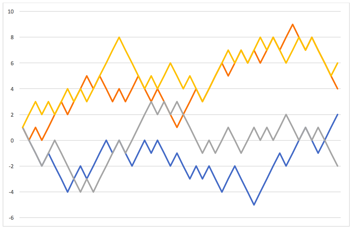
So which did better: heads or Netflix?
There’s really no way to tell the difference. They are essentially indistinguishable. To cut the suspense, the blue and orange lines are the coin flips, ExxonMobil is gray, and our winner, Netflix, was yellow.
In fact, the highest correlation was between coin #2 and Netflix, with a 0.75 correlation. The correlation between the two real stocks was only 0.23, which is pretty typical between two random US stocks.
You might be saying, “So what? Coin flips are random.”
That’s my point. If we can’t tell the difference between someone flipping a coin at their desk and actual stock returns, then those stock returns must be pretty random. If it looks like a duck and quacks like a duck, it’s probably a duck.
Paying attention to daily returns won’t do anything besides give you an ulcer. Since these daily returns are bouncing all over the place, you’re adding a lot of stress to your day that you just don’t need.
Daily Returns Will Steer You Wrong
Volatility is an inescapable part of the market, but most of the day-to-day noise comes out in the wash. Last year – 2023, was a pretty good year for the US stock market. The S&P 500 Index was up a little more than 26% for the year.
But what if we zoom in and look at the daily movements? To make my life a little easier we’ll be looking at the SPDR S&P 500 ETF instead of the index directly.
The sum of the absolute value of each day’s movement for the year was 162%. So the market moved almost 162% only to wind up about 26% away from its starting point. If you were focusing on the daily returns, you would have seen a little bit more than six times the swings than if you just zoomed out to an annual perspective – which is still pretty short term in terms of investing. That’s roughly the equivalent of driving from our headquarters in Tysons, Virginia to Pittsburgh, but deciding you don’t want to drive through the Appalachian mountains so you stop in Atlanta, Birmingham, and Louisville before heading to Pittsburgh.
It would be a lot easier to just forget about the mountains and focus on your destination.

- Heads was up and tails was down. The path for the first coin was: HTTTHTTTHHTHHHTHTTHHTHTTHTTHTHTTHHTTTHHHHTHHHTTHHH,
and the path for the second coin was: HTHTHHHTHHHTHTTHTHHTTHTTTHHHTHHHTHHTHTHHTHHTTHTTTT. ↩︎ - Data retrieved from Yahoo Finance. Past performance is not indicative of future returns. For illustration purposes only. ↩︎