While still within the realm of exploring classical studies about sustainable spending, we should look at an alternative way to frame the results and analysis. That is, rather than asking for the probability of success associated with a particular withdrawal rate, we could also calculate the highest sustainable withdrawal rate linked to a particular probability of success.
This discussion is based on my article “Capital Market Expectations, Asset Allocation, and Safe Withdrawal Rates,” which was published in the January 2012 issue of the Journal of Financial Planning.
There, I presented results for Monte Carlo simulations based on the same historical data that has guided my discussion thus far. For various retirement durations and acceptable failure rates, this method provides details about maximum sustainable withdrawal rates and optimal asset allocations.
Exhibit 1
Sustainable Withdrawal Rates Allowing for 10% Failure Probability
For a 30-Year Retirement, Inflation Adjustments
Efficient Frontier Based on SBBI Data, 1926-2015, S&P 500 and ITGB
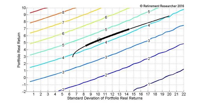
Exhibit 1 shows how sustainable withdrawal rates relate to the expectations about portfolio returns and volatilities when the allowed failure rate is set at 10% and the retirement duration is set at thirty years. As we move toward the upper left-hand corner of the figure, higher sustainable withdrawal rates are supported through combinations of higher portfolio returns and lower portfolio volatilities.
We can observe the lines in the figure that map out different withdrawal rates and how returns and standard deviations offset each other in order to maintain the same withdrawal rate.
The efficient frontier generated from the historical data, when combining large-capitalization stocks (S&P 500) with intermediate term government bonds, is included in this figure.
The points on this curve represent the highest possible returns for a given level of volatility, or the lowest volatility achievable with a given return. It is the standard formulation for an efficient frontier used in Modern Portfolio Theory, but it is overlaid on a graph that provides information about how different points on the frontier impact sustainable spending rates.
The asset allocation that maximizes the sustainable withdrawal rate of 4.4% is identified with a circle. In addition to the optimal asset allocation, the range of points on the efficient frontier (representing a range of asset allocations) that allow for a withdrawal rate within 0.1 percentage points of the maximum are highlighted with a thicker line.
But what is the optimal asset allocation and the range of asset allocations performing nearly as well? Though the figure allows us to see this directly, these answers are provided more clearly in Exhibit 2, which shows results for a wide variety of retirement durations and failure rates in the same sort of way as the Trinity study.
For the case just discussed—a thirty-year retirement with a 10% acceptable failure rate—the third column indicates a maximum sustainable withdrawal rate of 4.4% with these conditions. The next set of columns shows the optimal asset allocation to achieve this 4.4% withdrawal rate is 46% stocks and 54% bonds. This is a fixed asset allocation held throughout retirement with annual rebalancing.
The last four columns demonstrate the range of allocations in which one could expect to do nearly as well with a withdrawal rate within 0.1% of the maximum. Any stock allocation between 33% and 70% would support a withdrawal rate of 4.3%.
The exhibit further shows, unsurprisingly, that sustainable withdrawal rates are higher for shorter retirement durations and higher allowable failure probabilities. In addition, the optimal stock allocation tends to increase both for longer retirement durations and higher allowed failure probabilities.
This suggests that the upside potential from stocks is increasingly important to sustaining a longer retirement, and that an acceptance of greater lifestyle risk (the risk of portfolio depletion) allows for more aggressive behavior in relation to a higher spending rate and stock allocation.
Exhibit 2
Withdrawal Rate and Asset Allocation Guidelines for Retirees
Inflation-Adjusted Withdrawals
For Various Withdrawal Rates, Asset Allocations, and Retirement Durations
Monte Carlo Simulations Based on SBBI Data, 1926-2015
S&P 500 and Intermediate-Term Government Bonds
| Retirement Duration (Years) | Failure Rate (%) | Withdrawal Rate (%) | Optimal Asset Allocation (%) | For Withdrawal Rates Within 0.1% of Maximum | ||||
| Range Stocks | Range Bonds | |||||||
| Stocks | Bonds | Min | Max | Min | Max | |||
| 10 | 1 | 9.0 | 24 | 76 | 13 | 29 | 71 | 87 |
| 10 | 5 | 9.7 | 29 | 71 | 16 | 32 | 68 | 84 |
| 10 | 10 | 10.1 | 29 | 71 | 18 | 41 | 59 | 82 |
| 10 | 20 | 10.8 | 46 | 54 | 27 | 67 | 33 | 73 |
| 15 | 1 | 6.1 | 24 | 76 | 14 | 31 | 69 | 86 |
| 15 | 5 | 6.7 | 29 | 71 | 17 | 40 | 60 | 83 |
| 15 | 10 | 7.1 | 38 | 62 | 21 | 51 | 49 | 79 |
| 15 | 20 | 7.8 | 58 | 42 | 37 | 81 | 19 | 63 |
| 20 | 1 | 4.7 | 24 | 76 | 16 | 33 | 67 | 84 |
| 20 | 5 | 5.3 | 26 | 74 | 18 | 48 | 52 | 82 |
| 20 | 10 | 5.7 | 46 | 54 | 24 | 64 | 36 | 76 |
| 20 | 20 | 6.4 | 64 | 36 | 45 | 87 | 13 | 55 |
| 25 | 1 | 3.9 | 27 | 73 | 16 | 41 | 59 | 84 |
| 25 | 5 | 4.5 | 39 | 61 | 20 | 55 | 45 | 80 |
| 25 | 10 | 4.9 | 46 | 54 | 27 | 67 | 33 | 73 |
| 25 | 20 | 5.6 | 79 | 21 | 54 | 92 | 8 | 46 |
| 30 | 1 | 3.4 | 28 | 72 | 17 | 42 | 58 | 83 |
| 30 | 5 | 4.0 | 47 | 53 | 22 | 61 | 39 | 78 |
| 30 | 10 | 4.4 | 46 | 54 | 33 | 70 | 30 | 67 |
| 30 | 20 | 5.1 | 79 | 21 | 56 | 100 | 0 | 44 |
| 35 | 1 | 3.1 | 29 | 71 | 17 | 46 | 54 | 83 |
| 35 | 5 | 3.6 | 47 | 53 | 24 | 64 | 36 | 76 |
| 35 | 10 | 4.0 | 63 | 37 | 35 | 77 | 23 | 65 |
| 35 | 20 | 4.7 | 79 | 21 | 57 | 100 | 0 | 43 |
| 40 | 1 | 2.8 | 30 | 70 | 18 | 47 | 53 | 82 |
| 40 | 5 | 3.4 | 47 | 53 | 25 | 65 | 35 | 75 |
| 40 | 10 | 3.8 | 58 | 42 | 39 | 78 | 22 | 61 |
| 40 | 20 | 4.5 | 79 | 21 | 62 | 100 | 0 | 38 |
A wide range of asset allocations often support withdrawal rates that are nearly as high as the optimal allocation. This table provides clear evidence that lower stock allocations can compete with higher stock allocations in retiree portfolios, even when the results are based on the excellent performance of stocks found in the U.S. historical record.
This table has several advantages over the corresponding Trinity study shown before, despite being based on the same underlying data. Exhibit 2 uses Monte Carlo simulations, which, as I mentioned earlier, count each year of the historical data equally. It is not subject to the bias against bonds in the historical simulations resulting from an overweighting of the middle historical years. The information is more directly useful than portfolio success rates, as the table directly links acceptable failure rates with maximum withdrawal rates and optimal asset allocation.
The results also fit better with real world investing. With reduced risk capacity and tolerance, stock allocation recommendations for retirees tend to be lower than the 50-75% suggested in historical simulation studies. The table shows how a wide range of asset allocations work nearly as well as the optimum. And since the table is based on Monte Carlo simulations, it can be easily customized to allow changing capital market expectations and asset class choices.
Indeed, this was my objective for writing the initial research article. I wished to provide the opportunity for readers to see how their own assumptions would impact sustainable spending rates.
Users of the article would not be beholden to the assumptions and choices made by the authors of various research articles. The underlying figure remains the same, but you are free to develop your own efficient frontiers and map these onto the figure to observe the implications for retirement spending.
Next, read Safety-First Retirement Planning: An Integrated Approach for a Worry-Free Retirement.